This article primarily documents the process of testing Nano Banana, quickly recording personal experiences.
Today’s test is divided into two parts:
- Converting construction site photos to renderings
- Adjusting material details of existing rendered images
Construction Site Photos → Rendering Design#
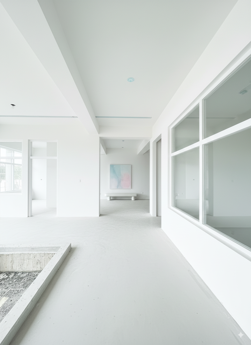
The main goal was to test whether we could design interior spaces directly from on-site photos (with only partial walls visible).
First, I tested style conversion to evaluate Nano Banana’s composition control capabilities.
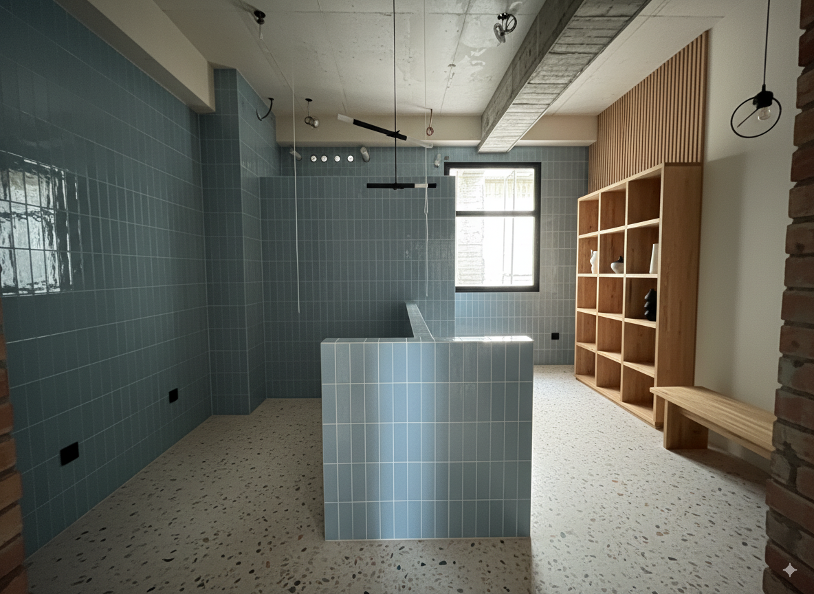
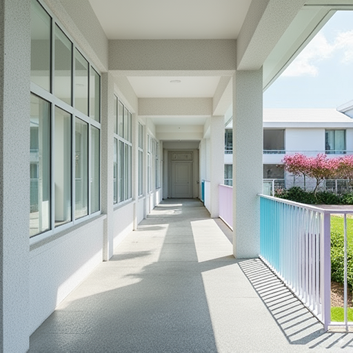
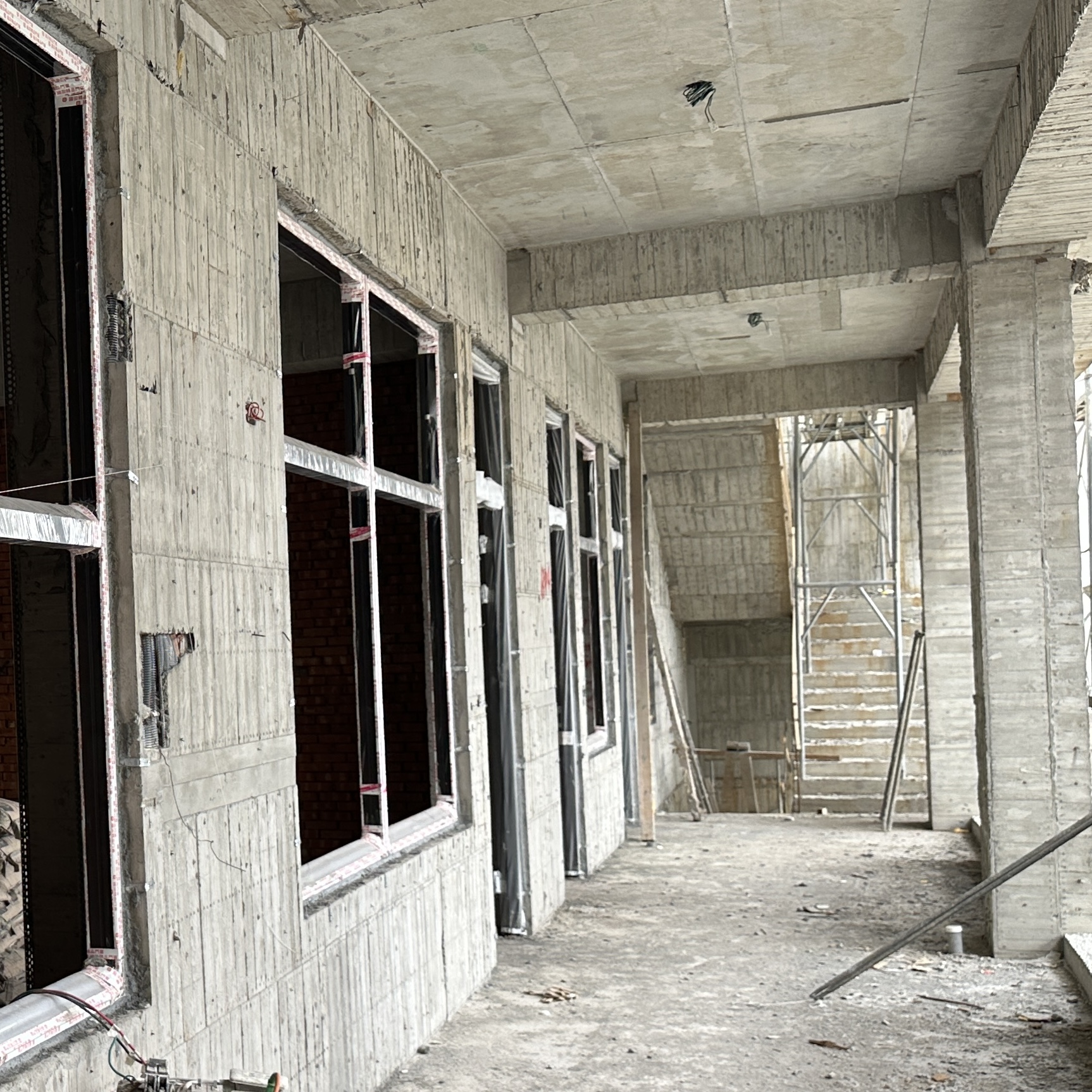
| On-site Photo 1 | On-site Photo 2 | Reference Style Image |
|---|---|---|
 |  |  |
For this test, I first used ChatGPT to convert this style photo into a “style text description,” which was then provided as a text prompt to Nano Banana.
ChatGPT 5 Instant:
“Minimalist contemporary architecture style, emphasizing clean geometric lines and uncluttered surfaces. Bright white facades that reflect natural light, smooth matte finishes, and a sense of crisp purity. Accents in pastel tones, such as soft blue and pink, add a subtle playful contrast to the otherwise neutral palette. Large glass elements evoke openness and transparency, while the overall atmosphere feels airy, calm, and serene. The style conveys modern simplicity, refined elegance, and a fresh, tranquil ambiance”
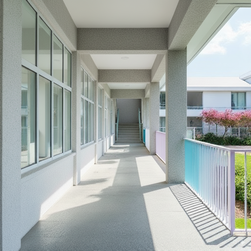
Phase 1-1#
| Prompt | Image | |
|---|---|---|
| Input | Convert the image into the following described style: Minimalist contemporary architecture style, emphasizing clean geometric lines and uncluttered surfaces. Bright white facades that reflect natural light, smooth matte finishes, and a sense of crisp purity. Accents in pastel tones, such as soft blue and pink, add a subtle playful contrast to the otherwise neutral palette. Large glass elements evoke openness and transparency, while the overall atmosphere feels airy, calm, and serene. The style conveys modern simplicity, refined elegance, and a fresh, tranquil ambiance | |
Output:
You can see there are slight differences in the input and output image proportions.
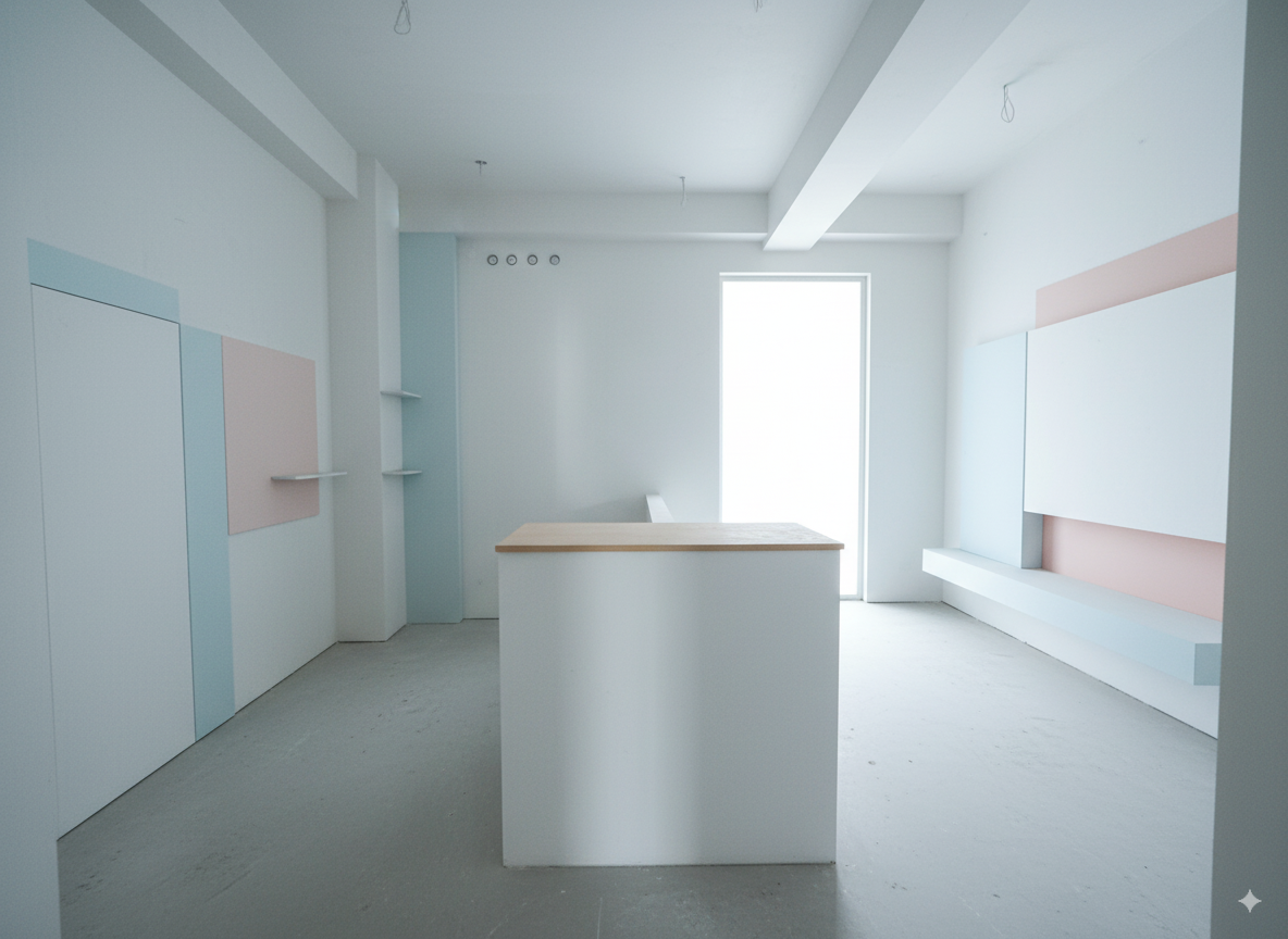
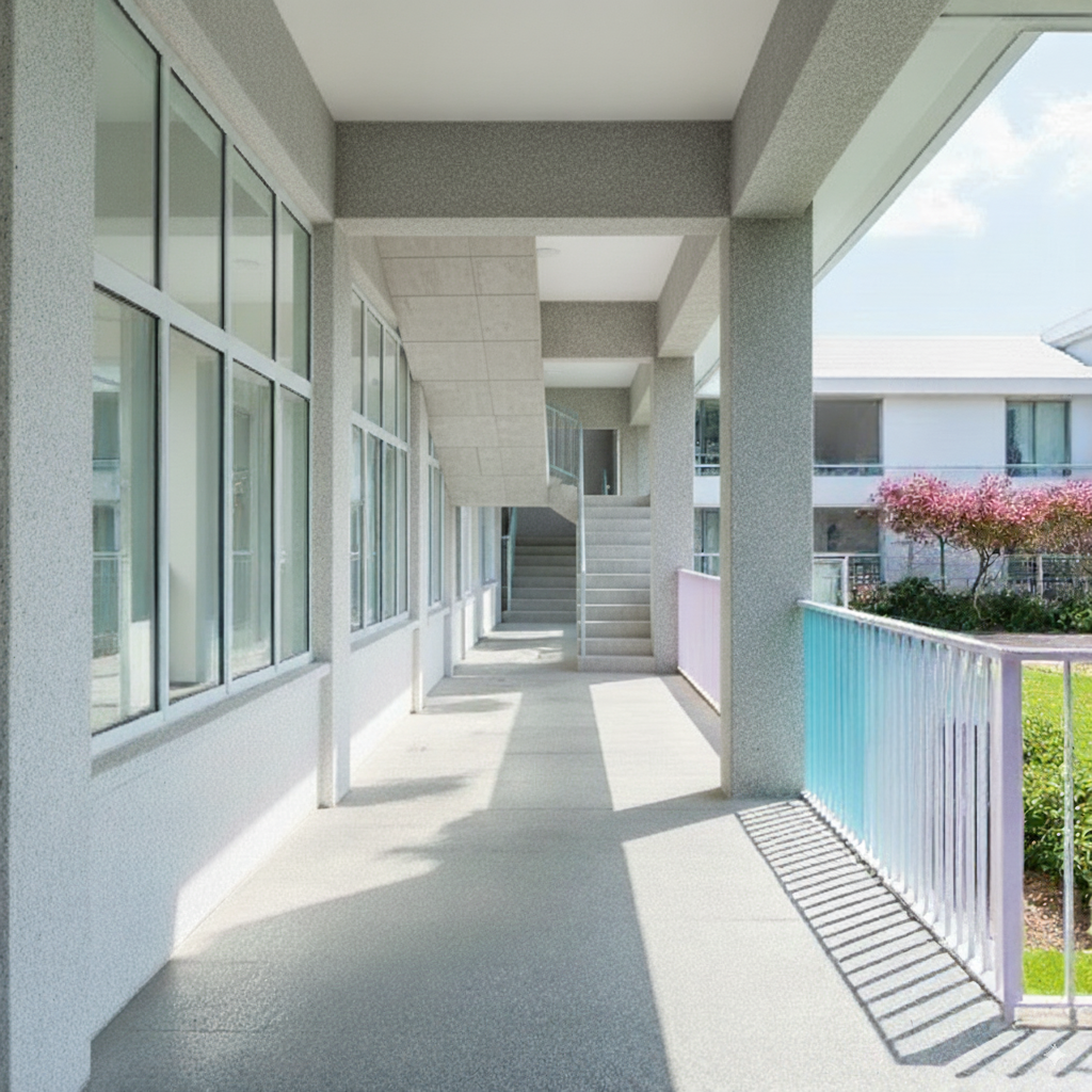
Phase 1-2#
Input to Nano Banana:
| Prompt | Image |
|---|---|
| Convert the image into the following described style: Minimalist contemporary architecture style, emphasizing clean geometric lines and uncluttered surfaces. Bright white facades that reflect natural light, smooth matte finishes, and a sense of crisp purity. Accents in pastel tones, such as soft blue and pink, add a subtle playful contrast to the otherwise neutral palette. Large glass elements evoke openness and transparency, while the overall atmosphere feels airy, calm, and serene. The style conveys modern simplicity, refined elegance, and a fresh, tranquil ambiance | |
Generated:
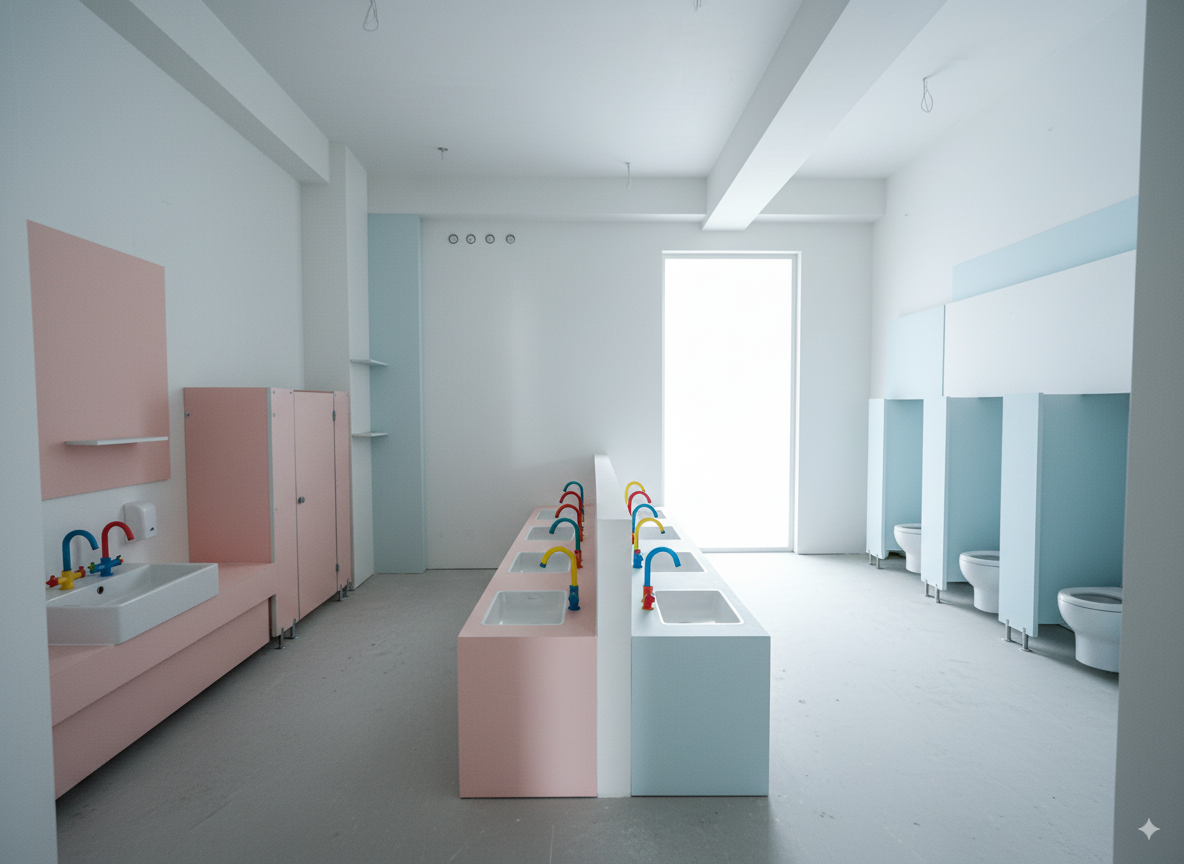
Then I continued the conversation, giving it hints about the main content of this space:
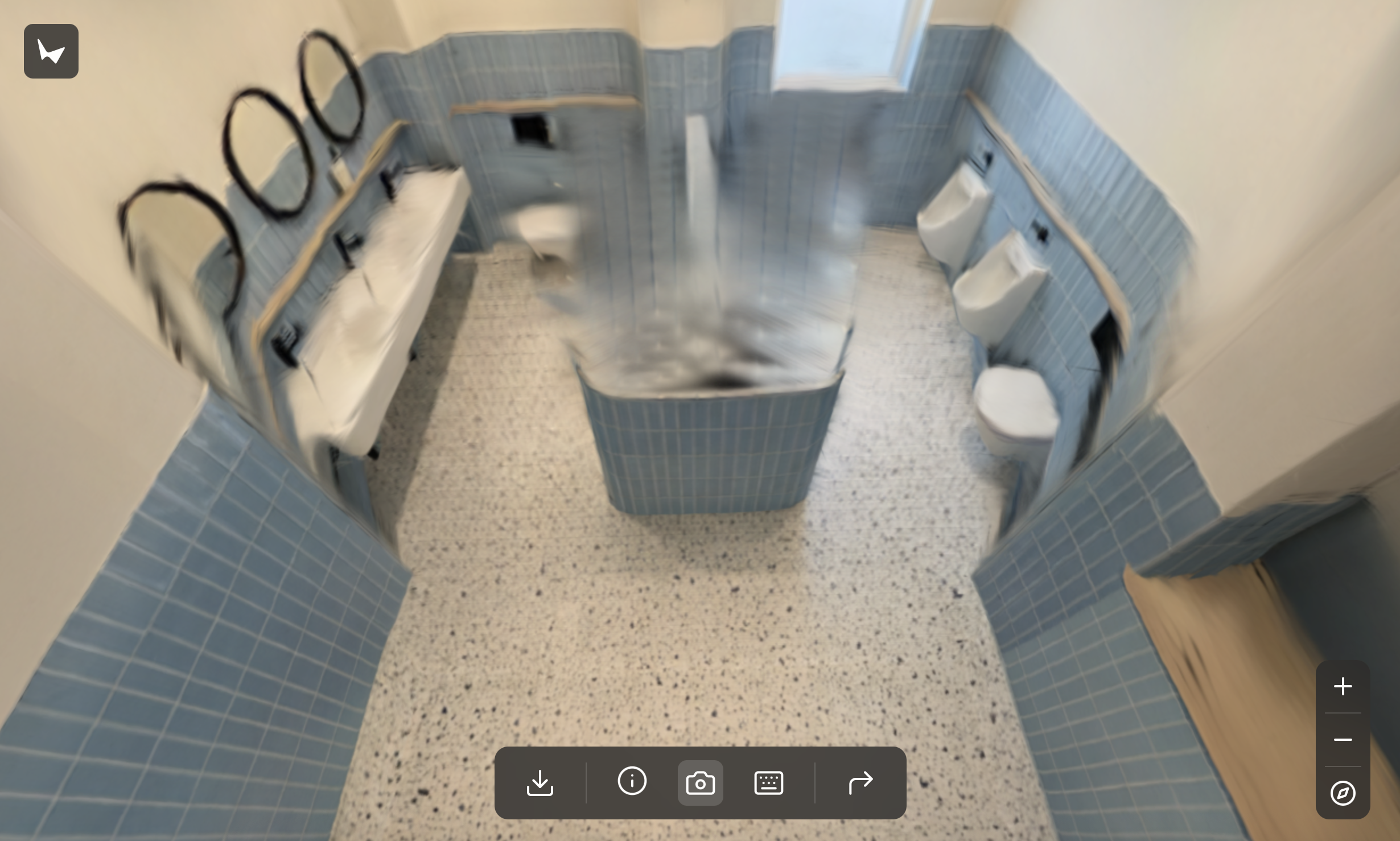
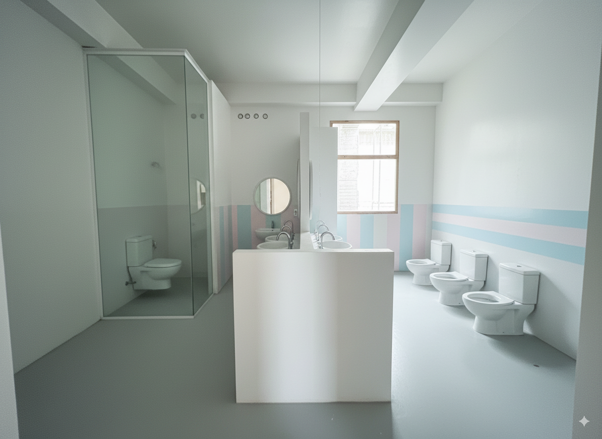
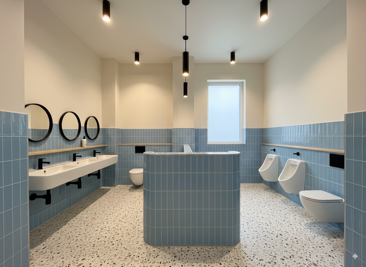
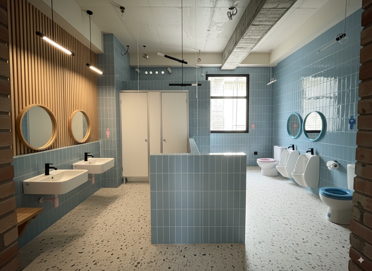
This rendering needs to be corrected, as the intended function of the space was misunderstood. This is actually a kindergarten restroom designed specifically for young children. The right side should be designated as the boys’ restroom, and the left side as the girls’ restroom. In the center, the low partition wall should have sinks on both sides for the children to wash their hands. Additionally, the opening at the back right is meant to be a window, not a door. Please update the design accordingly.
Output:
Phase 1-3#
Testing with a more complete prompt that includes both style and interior space description:
Convert the image into the following described style:
Minimalist contemporary architecture style, emphasizing clean geometric lines and uncluttered surfaces. Bright white facades that reflect natural light, smooth matte finishes, and a sense of crisp purity. Accents in pastel tones, such as soft blue and pink, add a subtle playful contrast to the otherwise neutral palette. Large glass elements evoke openness and transparency, while the overall atmosphere feels airy, calm, and serene. The style conveys modern simplicity, refined elegance, and a fresh, tranquil ambiance.
The image represents a kindergarten restroom designed for children. The right side is designated as the boys’ restroom, and the left side is designated as the girls’ restroom. At the back right, the opening shown is actually a window
Phase 2-1#
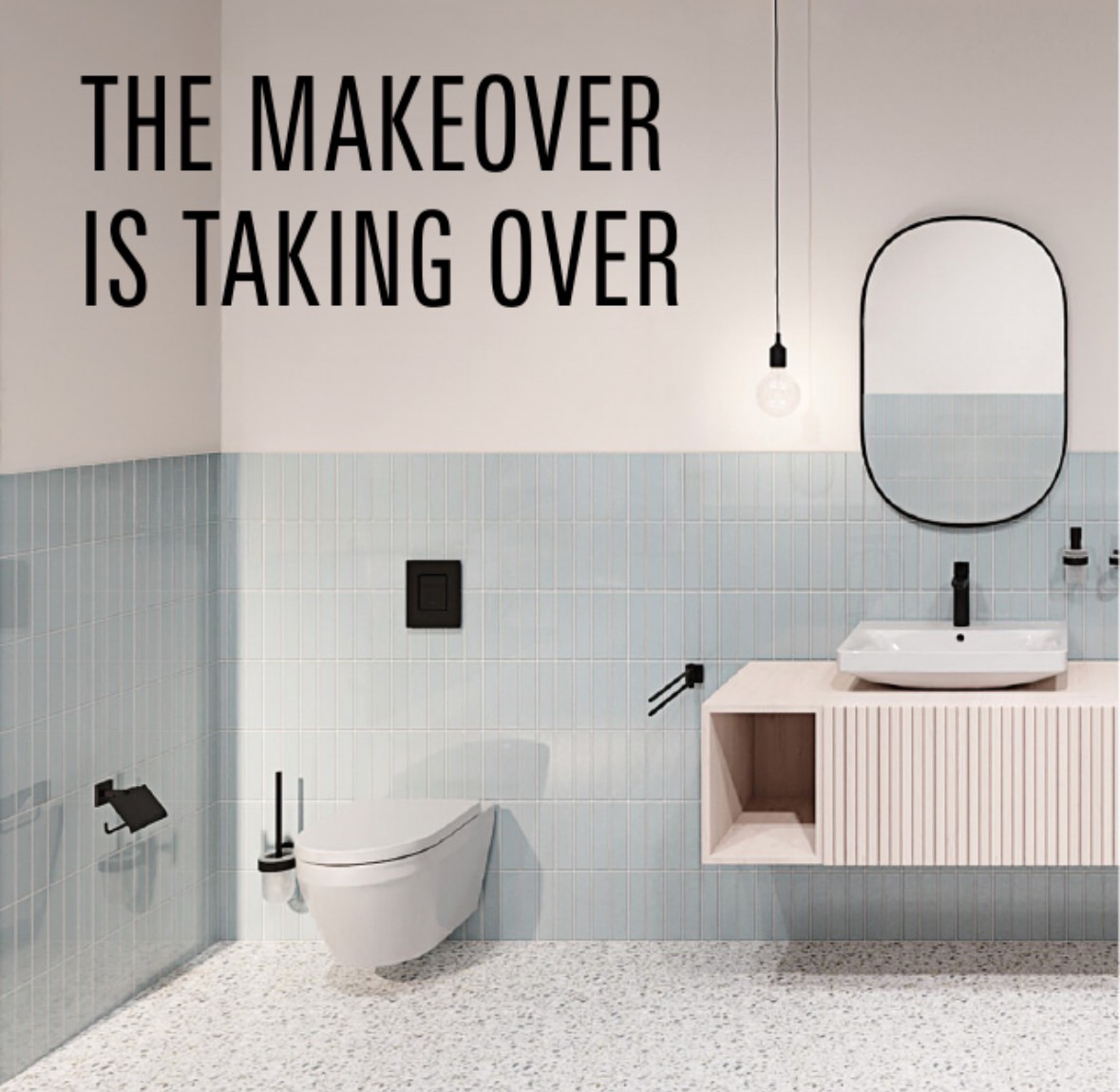
Next, I switched to another reference image, planning to completely reference the decoration materials and style from this poster.
First testing with base image + style reference image + text prompt:
Input:
| prompt | On-site Photo | Reference Style Poster |
|---|---|---|
| Convert the overall interior decoration style of this current powder-blue restroom rendering to match the materials and style shown in this poster. | | |
Output:
The composition completely lost control.
Phase 2-2#
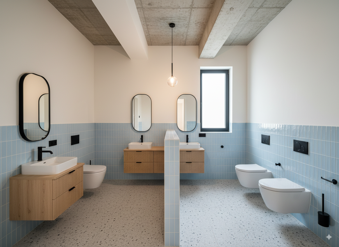
Later, I converted the poster into a text prompt using gemini-2.5-pro, then sent it along with the base image to nano banana, using the same method as before.
The most effective prompt was as follows:
Convert the image into the following described style:

### **Detailed Element Descriptions**

#### **Color Palette**
*   **Primary Colors:** The dominant colors are a soft **powder blue** or sky blue, and a warm **off-white** or cream.
*   **Accent Color:** A bold **matte black** is used consistently across all fixtures and hardware, providing a strong graphic contrast.
*   **Natural Tones:** A **light, natural wood** tone (like pale oak or ash) adds warmth and an organic element.
*   **Neutral Base:** The floor is a neutral base of **light grey and white** with multi-tonal specks.

#### **Walls**
*   **Treatment:** The walls feature a two-tone or "half-tiled" design. The upper portion is a smooth, painted surface in a warm off-white, creating a sense of openness and height.
*   **Tiling:** The lower portion of the walls is clad in vertically-stacked, slender ceramic tiles. This style is often referred to as **"kit-kat" or "finger" tiles**. They have a uniform, light powder-blue color with a subtle satin or low-sheen finish. The grout is a light, non-contrasting color, which emphasizes the vertical lines and texture.

#### **Flooring**
*   **Material:** The floor is made of **terrazzo**.
*   **Appearance:** It features a light grey or white cementitious base with a dense pattern of small, multi-colored aggregate (stone chips). The specks appear to be in various neutral shades of grey, black, and possibly beige, creating a subtle, textured pattern that is both durable and visually interesting.

The image represents a kindergarten restroom designed for children. The right side is designated as the boys' restroom, and the left side is designated as the girls' restroom. At the back right, the opening shown is actually a window
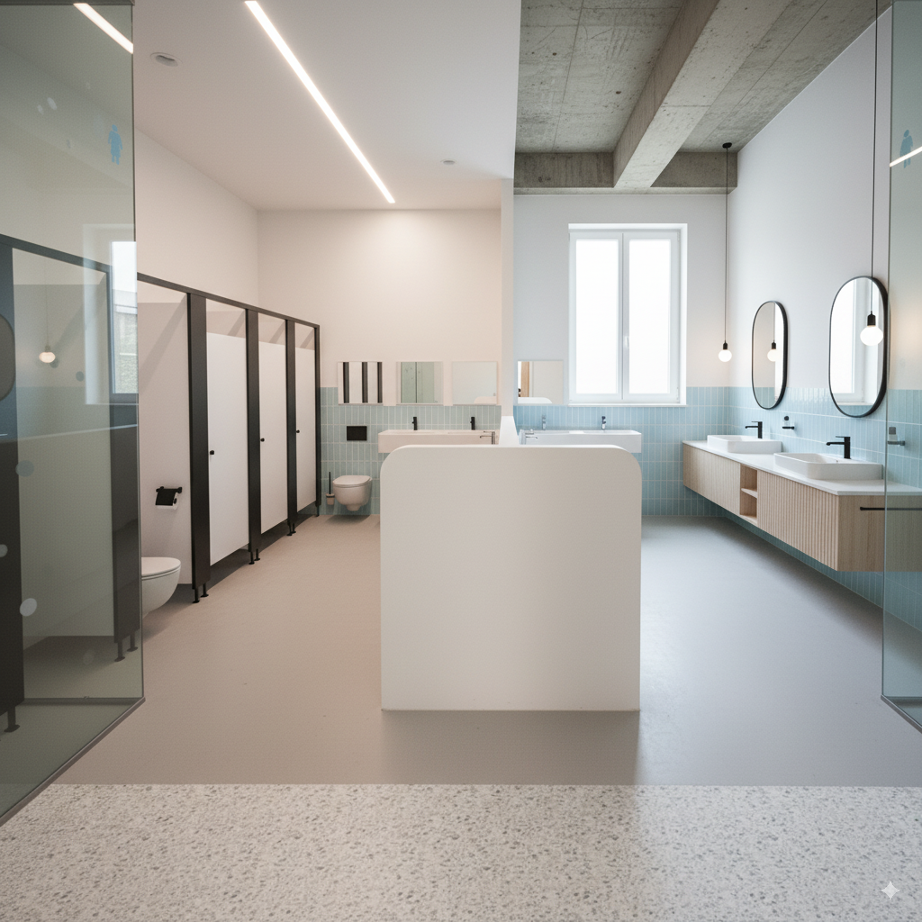
Output:
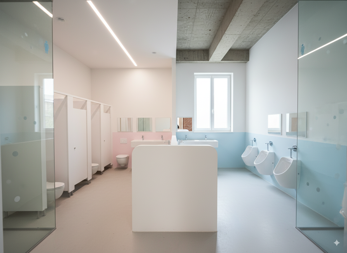
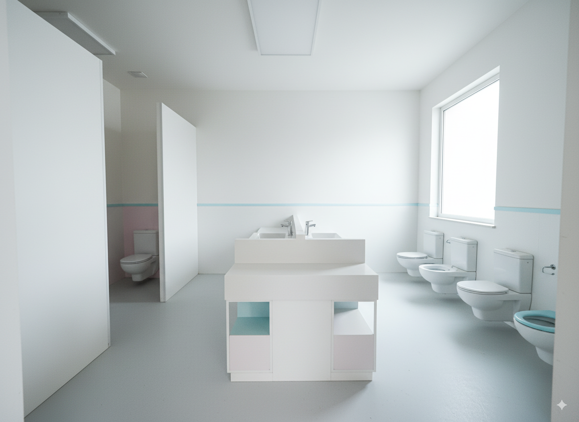
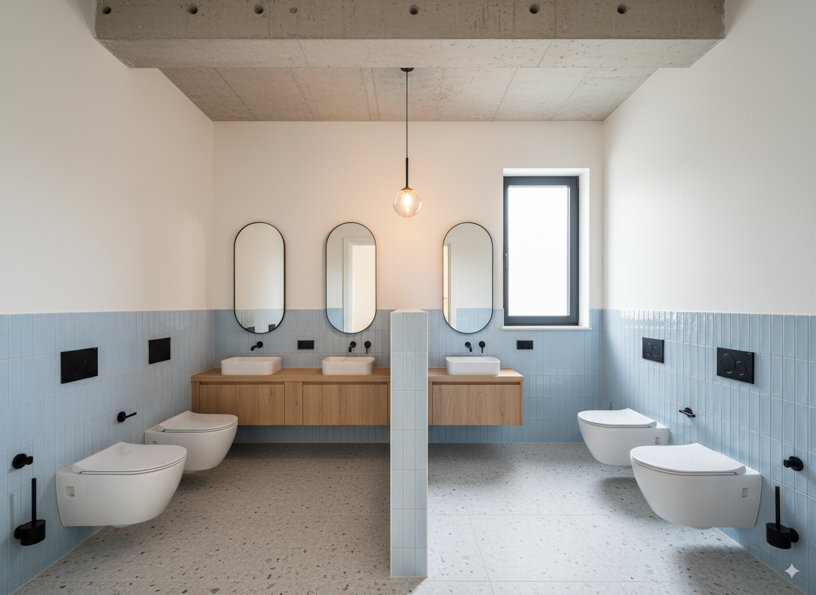
Other test outputs:
Rendering → Apply Real Materials, Adjust Space Details#
This phase attempted to adjust details in an existing rendered image.
Phase 1-1#
Using the above image as a base, changing the white walls, columns, etc. to the following paint material:
Direct image reference:
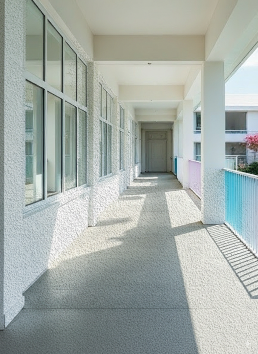
The composition proportions were out of control, and the material grain was too large (Scale didn’t automatically align). Even after subsequent conversations asking it to adjust texture mapping, it still couldn’t be fixed.
It’s strange, I feel like it should work. Otherwise, converting the reference image to text would lose a lot of details. I might need to adjust the text prompt part later.
Phase 1-2#
Changed to describing the material as text and using text as prompt:
Output:
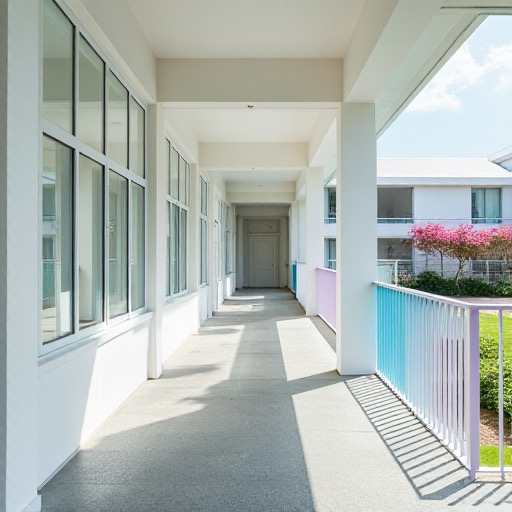
The material grain is normal, but the color tone has some deviation, probably due to the text description.
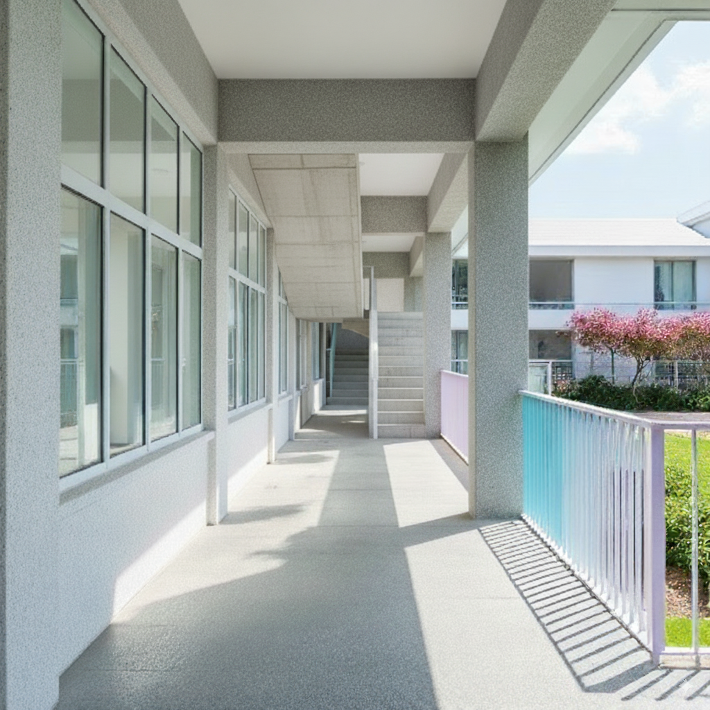
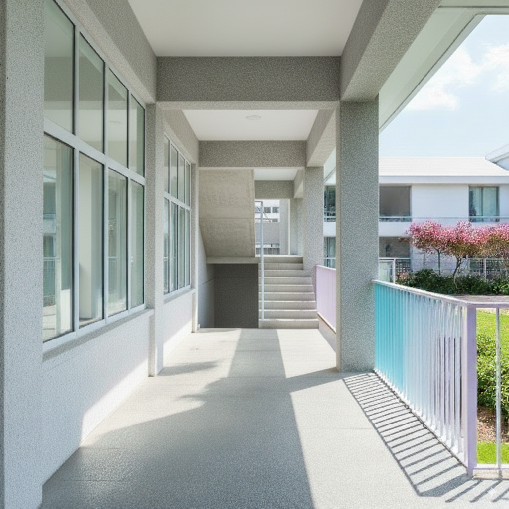
Phase 2#
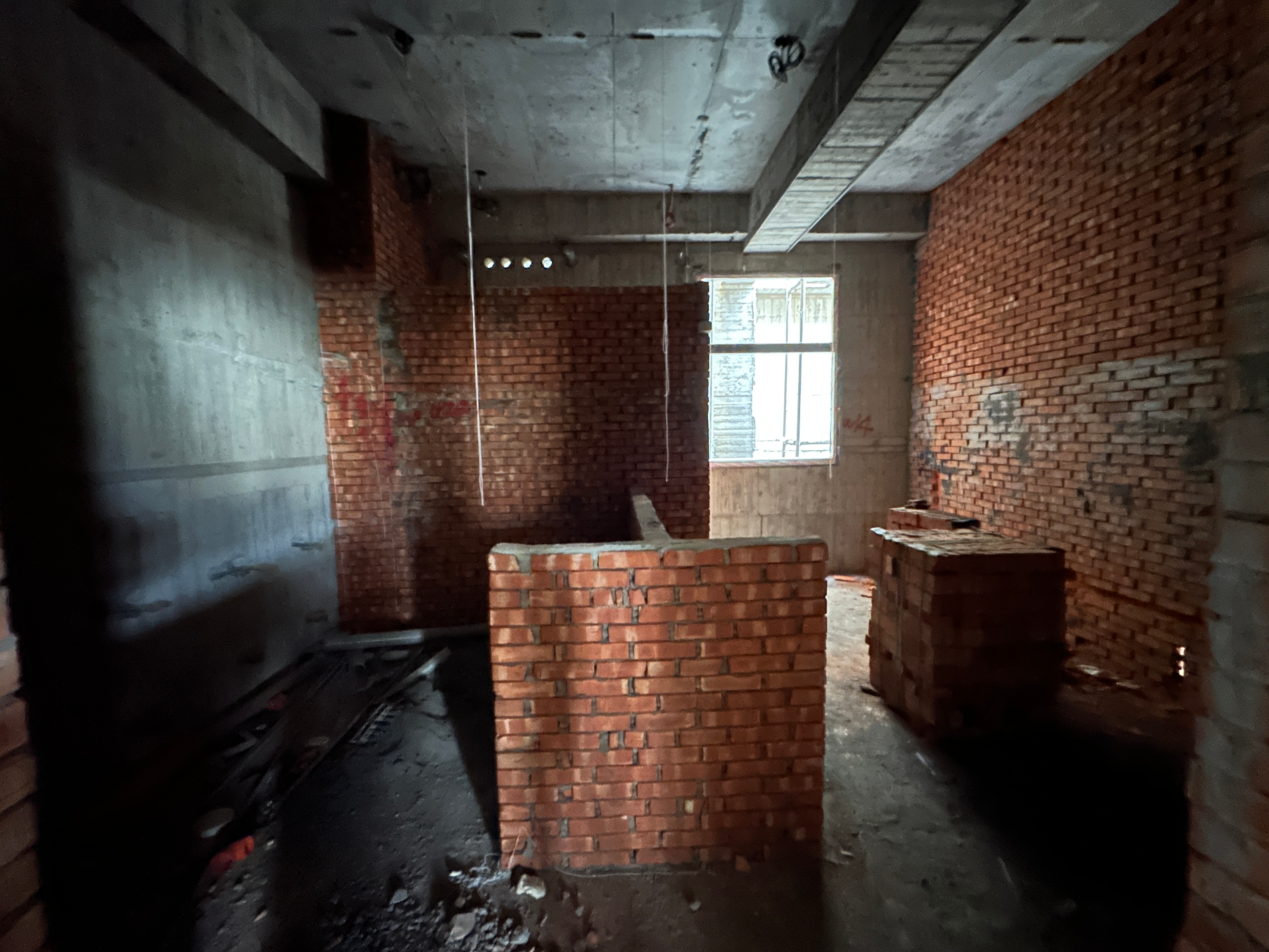
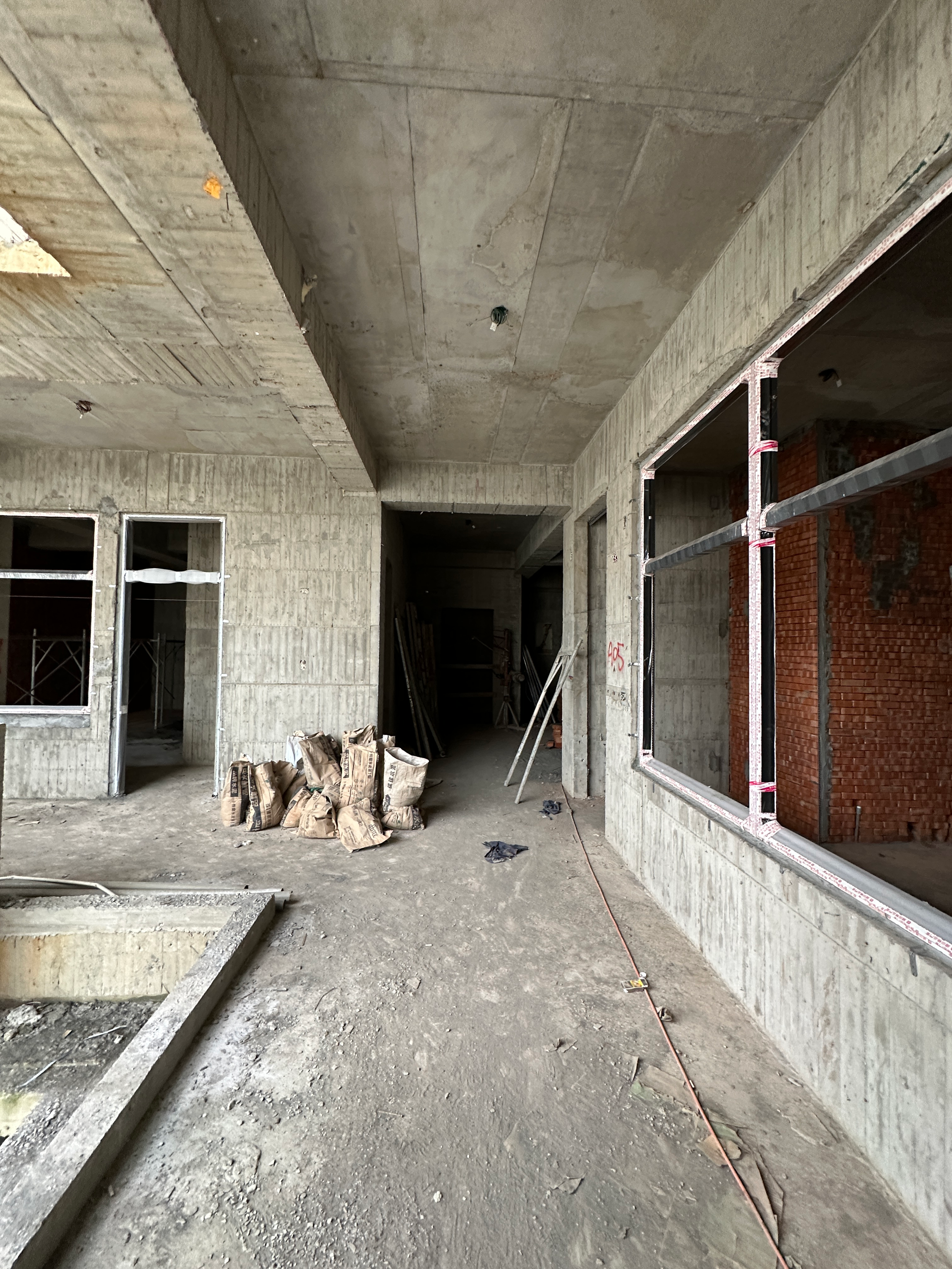
Adjusting incorrect details in the rendering (changing the door at the end of the corridor to stairs)
Testing included three approaches:
- Direct text description or
- Providing the following reference image
- Editing the reference image with Zoom in (crop) into the stairs part and then providing it as reference
Results
Pure text:


Reference image (without zooming into the stairs part):
Repeated tests:
Reference image (with zoom into the stairs part):
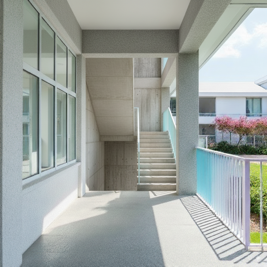
Repeated tests:
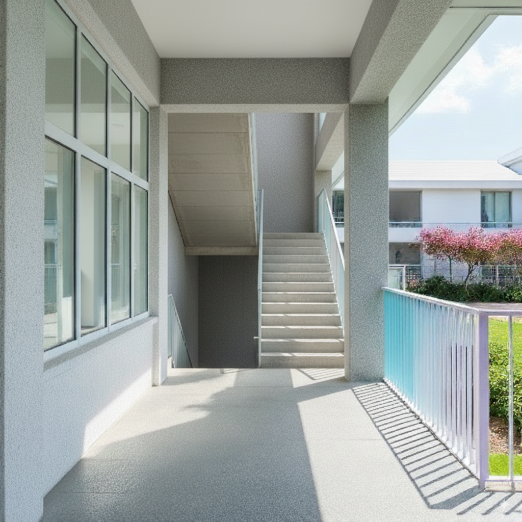
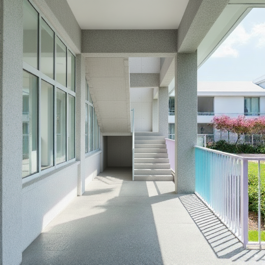
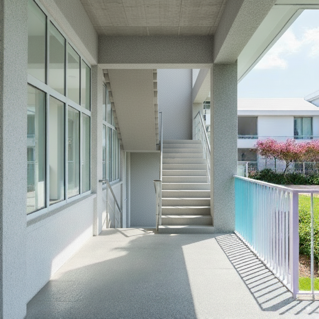
I found that using direct text works better than reference images. Reference images also affect the output composition, causing the entire architectural space to change in the generated results.
Summary#
From this testing phase, I feel that the main issue is that the base image itself has too much noise, leading to unstable output. Additionally, this space itself is difficult to describe directly with text (there’s still a partition at the back, but only two generated results showed it slightly).
Worth testing other approaches in the future:
- First convert the on-site image to a clean white model line drawing, then generate renderings (perhaps adjust model details in the white model state in between)
- Combine with floor plans to provide spatial descriptions for the model (I don’t think the success rate will be high)
Extra#
Finally, I tried directly feeding it to World Labs’ Marble for scene generation (another complex topic).
Click the image below to enter Marble World!