This tutorial will guide you through adding image comparison slider functionality to your Hugo Blowfish theme step by step. This feature allows readers to compare two images by dragging a slider, making it perfect for showcasing before-and-after comparisons, design changes, and more.
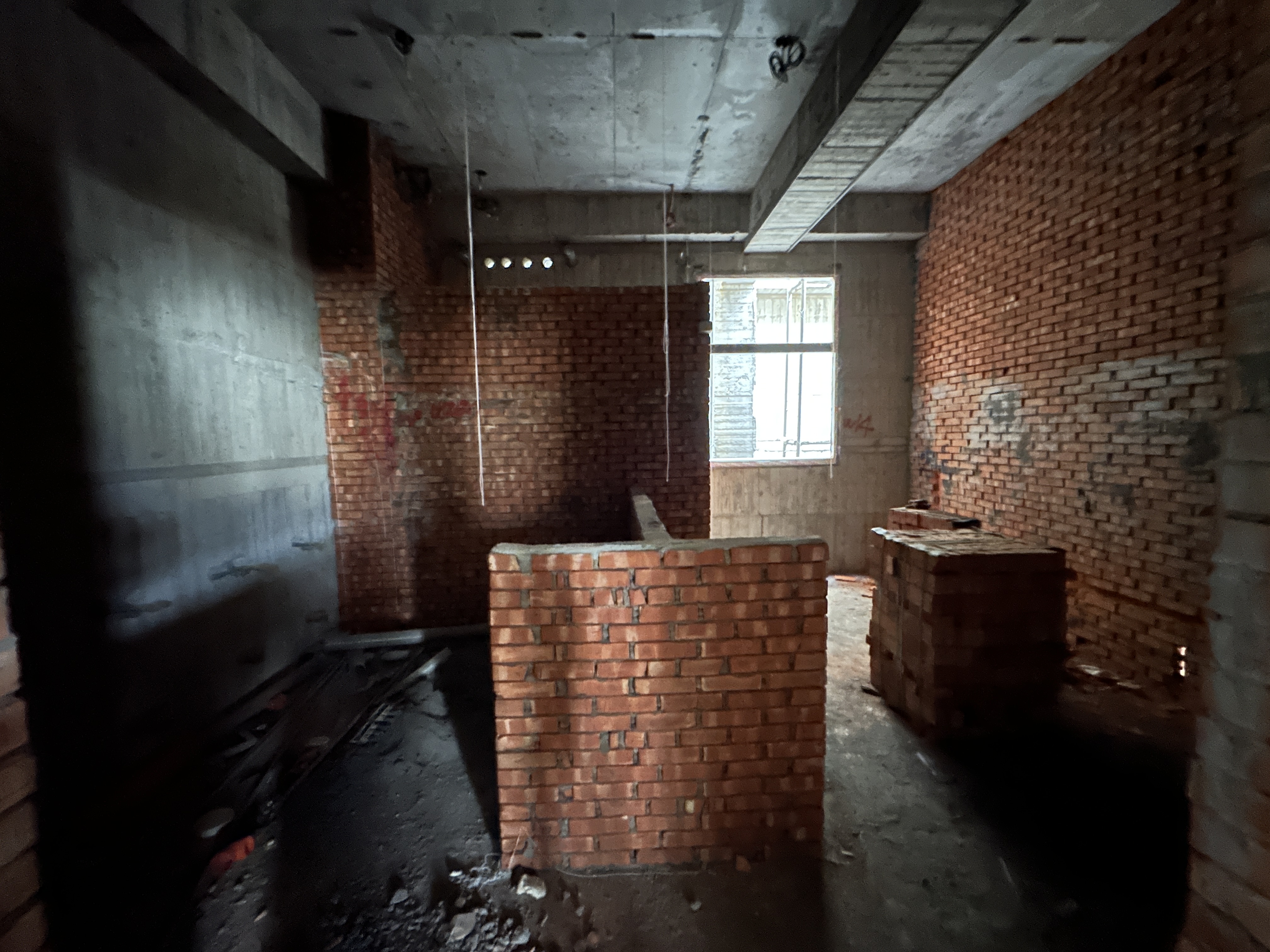
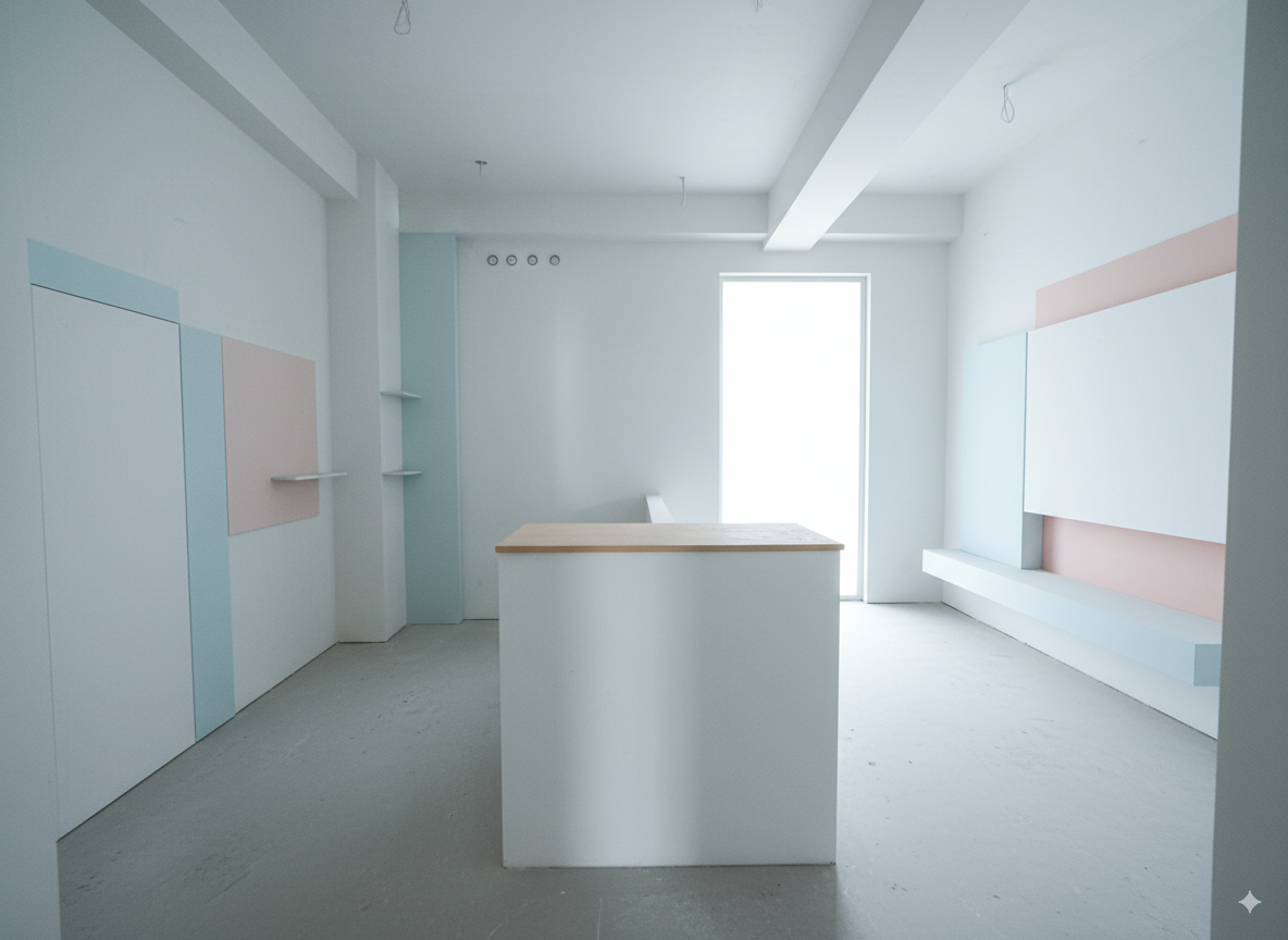
Final Result Preview#
After completing this tutorial, you’ll be able to showcase image comparison features like this in your articles:
Prerequisites#
Before we begin, make sure you have:
- A Hugo site with the Blowfish theme installed
- Basic knowledge of Hugo shortcodes
- Access to your site’s theme files or the ability to create custom shortcodes
Step 1: Create the Image Comparison Shortcode#
First, we need to create a custom shortcode for the image comparison functionality. Create a new file in your Hugo site:
File: layouts/_shortcodes/img-comparison.html
<div class="image-comparison-container">
  <div class="image-comparison-wrapper">
    <div class="image-comparison-slider">
      <div class="image-comparison-before">
        <img src="{{ .Get "image1" }}" alt="{{ .Get "alt1" }}" loading="lazy">
        <div class="image-comparison-label before-label">Before</div>
      </div>
      <div class="image-comparison-after">
        <img src="{{ .Get "image2" }}" alt="{{ .Get "alt2" }}" loading="lazy">
        <div class="image-comparison-label after-label">After</div>
      </div>
      <div class="image-comparison-handle">
        <div class="image-comparison-handle-line"></div>
        <div class="image-comparison-handle-circle">
          <svg width="24" height="24" viewBox="0 0 24 24" fill="none" xmlns="http://www.w3.org/2000/svg">
            <path d="M8 5L16 12L8 19" stroke="currentColor" stroke-width="2" stroke-linecap="round" stroke-linejoin="round"/>
            <path d="M16 5L8 12L16 19" stroke="currentColor" stroke-width="2" stroke-linecap="round" stroke-linejoin="round"/>
          </svg>
        </div>
      </div>
    </div>
    {{ if .Get "caption" }}
    <div class="image-comparison-caption">{{ .Get "caption" }}</div>
    {{ end }}
  </div>
</div>

<script>
document.addEventListener('DOMContentLoaded', function() {
  const containers = document.querySelectorAll('.image-comparison-container');

  containers.forEach(container => {
    const slider = container.querySelector('.image-comparison-slider');
    const handle = container.querySelector('.image-comparison-handle');
    const beforeImg = container.querySelector('.image-comparison-before img');
    const afterImg = container.querySelector('.image-comparison-after img');

    let isDragging = false;

    // Set initial position
    let currentPosition = 50;
    updateSlider(currentPosition);

    function updateSlider(position) {
      currentPosition = Math.max(0, Math.min(100, position));
      slider.style.setProperty('--slider-position', currentPosition + '%');
      beforeImg.style.clipPath = `inset(0 ${100 - currentPosition}% 0 0)`;
    }

    function handleMouseDown(e) {
      isDragging = true;
      handle.style.cursor = 'grabbing';
      e.preventDefault();
    }

    function handleMouseMove(e) {
      if (!isDragging) return;

      const rect = slider.getBoundingClientRect();
      const x = e.clientX - rect.left;
      const percentage = (x / rect.width) * 100;
      updateSlider(percentage);
    }

    function handleMouseUp() {
      isDragging = false;
      handle.style.cursor = 'grab';
    }

    function handleClick(e) {
      if (e.target === slider || e.target === beforeImg || e.target === afterImg) {
        const rect = slider.getBoundingClientRect();
        const x = e.clientX - rect.left;
        const percentage = (x / rect.width) * 100;
        updateSlider(percentage);
      }
    }

    // Event listeners
    handle.addEventListener('mousedown', handleMouseDown);
    document.addEventListener('mousemove', handleMouseMove);
    document.addEventListener('mouseup', handleMouseUp);
    slider.addEventListener('click', handleClick);

    // Touch events for mobile
    handle.addEventListener('touchstart', (e) => {
      isDragging = true;
      e.preventDefault();
    });

    document.addEventListener('touchmove', (e) => {
      if (!isDragging) return;
      const rect = slider.getBoundingClientRect();
      const x = e.touches[0].clientX - rect.left;
      const percentage = (x / rect.width) * 100;
      updateSlider(percentage);
      e.preventDefault();
    });

    document.addEventListener('touchend', () => {
      isDragging = false;
    });
  });
});
</script>
Step 2: Add CSS Styles#
Now we need to add the CSS styles for our image comparison component. Add this to your site’s CSS file or in a <style> block in your theme:
File: assets/css/custom.css (or add to your existing CSS file)
.image-comparison-container {
  margin: 2rem 0;
  border-radius: 8px;
  overflow: hidden;
  box-shadow: 0 4px 6px -1px rgba(0, 0, 0, 0.1), 0 2px 4px -1px rgba(0, 0, 0, 0.06);
}

.image-comparison-wrapper {
  position: relative;
  width: 100%;
  height: 400px; /* Adjust height as needed */
}

.image-comparison-slider {
  position: relative;
  width: 100%;
  height: 100%;
  overflow: hidden;
  cursor: grab;
  --slider-position: 50%;
}

.image-comparison-slider:active {
  cursor: grabbing;
}

.image-comparison-before,
.image-comparison-after {
  position: absolute;
  top: 0;
  left: 0;
  width: 100%;
  height: 100%;
}

.image-comparison-before {
  z-index: 1;
}

.image-comparison-after {
  z-index: 2;
  clip-path: inset(0 0 0 var(--slider-position));
}

.image-comparison-before img,
.image-comparison-after img {
  width: 100%;
  height: 100%;
  object-fit: cover;
  display: block;
}

.image-comparison-handle {
  position: absolute;
  top: 0;
  left: var(--slider-position);
  width: 4px;
  height: 100%;
  background: #fff;
  z-index: 3;
  cursor: grab;
  transform: translateX(-50%);
}

.image-comparison-handle:active {
  cursor: grabbing;
}

.image-comparison-handle-line {
  width: 100%;
  height: 100%;
  background: #fff;
  box-shadow: 0 0 0 1px rgba(0, 0, 0, 0.1);
}

.image-comparison-handle-circle {
  position: absolute;
  top: 50%;
  left: 50%;
  transform: translate(-50%, -50%);
  width: 40px;
  height: 40px;
  background: #fff;
  border: 2px solid #e5e7eb;
  border-radius: 50%;
  display: flex;
  align-items: center;
  justify-content: center;
  box-shadow: 0 2px 4px rgba(0, 0, 0, 0.1);
  transition: all 0.2s ease;
}

.image-comparison-handle-circle:hover {
  border-color: #3b82f6;
  box-shadow: 0 4px 8px rgba(0, 0, 0, 0.15);
}

.image-comparison-handle-circle svg {
  width: 16px;
  height: 16px;
  color: #6b7280;
}

.image-comparison-label {
  position: absolute;
  top: 1rem;
  padding: 0.5rem 1rem;
  background: rgba(0, 0, 0, 0.7);
  color: white;
  border-radius: 4px;
  font-size: 0.875rem;
  font-weight: 500;
  z-index: 4;
}

.before-label {
  left: 1rem;
}

.after-label {
  right: 1rem;
}

.image-comparison-caption {
  text-align: center;
  margin-top: 1rem;
  font-size: 0.875rem;
  color: #6b7280;
  font-style: italic;
}

/* Dark mode support */
@media (prefers-color-scheme: dark) {
  .image-comparison-handle {
    background: #374151;
  }

  .image-comparison-handle-line {
    background: #374151;
    box-shadow: 0 0 0 1px rgba(255, 255, 255, 0.1);
  }

  .image-comparison-handle-circle {
    background: #374151;
    border-color: #4b5563;
  }

  .image-comparison-handle-circle:hover {
    border-color: #60a5fa;
  }

  .image-comparison-handle-circle svg {
    color: #9ca3af;
  }
}

/* Responsive design */
@media (max-width: 768px) {
  .image-comparison-wrapper {
    height: 300px;
  }

  .image-comparison-handle-circle {
    width: 32px;
    height: 32px;
  }

  .image-comparison-handle-circle svg {
    width: 14px;
    height: 14px;
  }

  .image-comparison-label {
    font-size: 0.75rem;
    padding: 0.25rem 0.75rem;
  }

  .before-label {
    left: 0.5rem;
  }

  .after-label {
    right: 0.5rem;
  }
}
Step 3: Usage in Your Articles#
Now you can use the image comparison shortcode in any of your Hugo articles:


Parameters:#
image1: Path to the “before” imageimage2: Path to the “after” imagealt1: Alt text for the “before” imagealt2: Alt text for the “after” imagecaption: Optional caption displayed below the comparison
Step 4: Customization Options#
Adjusting Height#
You can modify the height by changing the CSS:
.image-comparison-wrapper {
  height: 500px; /* Change this value */
}
Changing Colors#
Customize the handle and label colors:
.image-comparison-handle {
  background: #your-color;
}

.image-comparison-handle-circle {
  background: #your-color;
  border-color: #your-border-color;
}
Adding Animation#
Add smooth transitions:
.image-comparison-after {
  transition: clip-path 0.1s ease;
}
Troubleshooting#
Images Not Loading#
- Ensure image paths are correct relative to your content directory
- Check that images are in the correct folder structure
- Verify file permissions
Slider Not Working#
- Make sure JavaScript is enabled
- Check browser console for errors
- Ensure the shortcode HTML is properly formatted
Styling Issues#
- Verify CSS is being loaded
- Check for conflicting styles
- Use browser developer tools to inspect elements
Advanced Features#
Multiple Comparisons in One Article#
You can use multiple image comparison shortcodes in the same article:


Integration with Blowfish Theme#
The image comparison component is designed to work seamlessly with the Blowfish theme’s dark/light mode switching and responsive design.
Conclusion#
You’ve successfully added image comparison slider functionality to your Hugo Blowfish theme! This feature will enhance your articles by allowing readers to easily compare before-and-after images, making your content more engaging and informative.
The implementation includes:
- ✅ Responsive design that works on all devices
- ✅ Touch support for mobile users
- ✅ Dark mode compatibility
- ✅ Smooth animations and interactions
- ✅ Customizable styling
- ✅ SEO-friendly with proper alt text support
Feel free to customize the styling and functionality to match your site’s design preferences!